Let's have another new logo
Matti is unimpressed that the notetaking app Obsidian has a new logo.
Change. It happens all the time. Thunderbird has a new logo too (and for that matter so do Porsche, Jaguar/Land Rover, and NYC - like I said, happens a lot).
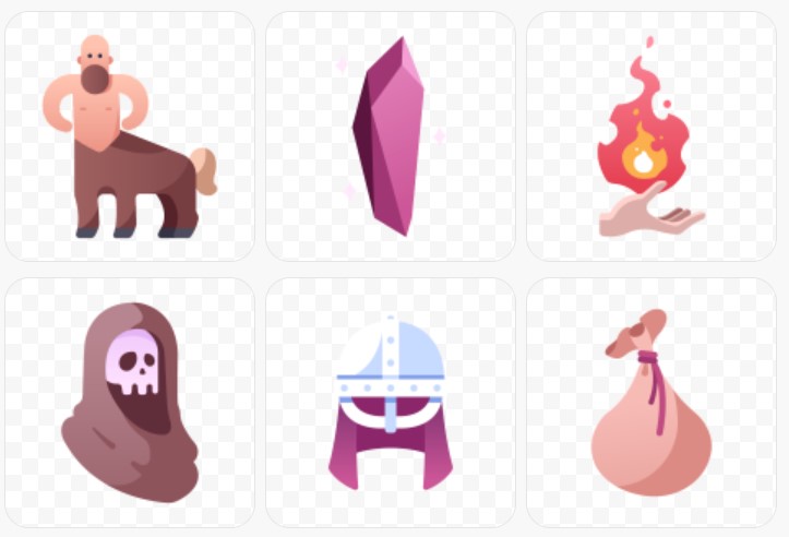
In general I don’t care, but you could claim this is really Obsidian’s first branding exercise. The OG logo was just pulled off an indifferent set of icons for RPGs. It was barely even a branding exercise back then, so maybe they’re justified in finally giving it a bit more thought now.

I’m pretty sure top right is someone who hates the Firefox logo enough to set fire to it, but not enough to drop it.
Perhaps it’s like army parades. I mean, if the troops can march in time there’s a chance they’ll also fight OK. And if not, then not. Same with your app’s logo.1 If you can’t design a good logo then what’s the actual product going to be like?
Signalling seems to matter.
Although now that I’ve said all this, some exceptions are popping into mind. That arbitrary traffic cone logo of VLC, is one. Terrible logo, but very useful app. Or the equally arbitrary mitsudomoe logo of OBS Studio - also a worthwhile app, all the same. And I really like the TiddlyWiki app, even though everything about its branding is confused and underwhelming, imho. Meanwhile, until now Obsidian the app also seems to have been performing better than Obsidian the logo.
Now these have all been passion projects made by people who seem really to value the product and the community that uses it. So perhaps updating the logo is a signal, as Matti suspects, that the focus may be moving away from the users and towards some other target - investors, shareholders, purchasers, who knows?
I’ll make one exception, though. Whatever the real reason for the change, the Thunderbird logo absolutely did need a re-vamp, since the old one does look exactly like an envelope wearing a wig.
But how come I only just noticed this when they mentioned it on their blog? Once you’ve seen it you can’t un-see it.
-
OK, they’re not the actual same, it’s just a hyperbolic simile. Or is it metaphorical hyperbole? ↩︎